U.S Climate Resilience Toolkit
This framework helps you document climate hazards that could harm the things you care about, decide which situations you most want to avoid, and come up with workable solutions to reduce your climate-related risks. Watch the video, get an overview of the steps, or click any step to learn more.
After my recent attempts to describe the Climate Explorer, I just came across this great explanation (below) of how to use it.
Build your own climate story that includes real numbers
The section labeled “Build a short story about the number of hot days per year in your location” is exactly how I envisioned working with the Climate Explorer. That section leads you through the steps to get the data you need for where you live, to be inserted into a story such as:
Late last century, [county name] County had about [1961-1990 observed average] days per year when the temperature reached 90°F or higher. If emissions of heat-trapping gases continue increasing, the county is projected to see around [2050s projection for higher emissions] hot days per year in the middle of this century, and about [2090s projection for higher emissions] hot days per year at the end of the century.
Using Climate Explorer to get a feel for Future Conditions
Are you curious about how climate change will affect your region in the coming decades? Graphs and maps in The Climate Explorer can help you get a sense of the past, present, and future climate projected for your location.
Get Started
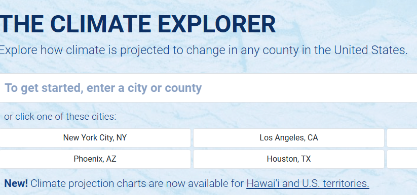
- Click in the To get started… search field on the Climate Explorer page.
- Enter a city or county name, then click the location you want in the drop-down list.
- The Cards Home page shows all the features available for the location you chose.
To explore your climate, scroll down in this panel, or roll your cursor over the column of dots on the left to view the table of contents.
What do the Climate Graphs show?
Try this »
- Click the Climate Graphs card.
The Average Daily Maximum Temperature (°F) graph shows afternoon high temperatures for the location you chose, from 1950 all the way to 2100.
- The gray, red, and blue bands show temperatures calculated by global climate models. Dark gray bars show observations from weather and climate stations.
- The red and blue bands show projections—scientific predictions for the future—of how maximum daily temperature will change over the next several decades.
- The rising trend of the red and blue bands show that maximum daily temperatures are projected to get warmer through this century.
Try this »
- Click the main dropdown menu (labeled Average Daily Maximum Temperature) to see the full list of variables you can explore.
- Roll your cursor over the ? icons to see information about any variable.
- Scroll down to learn more about reading these graphs.
Why do the graphs show shaded bands instead of single lines?
No single climate model can accurately predict future climate conditions at all locations. Rather, the best attempts to predict future conditions come from combining the results of many climate models that all ran the same experiment. The wide bands in these graphs represent the entire set of results from a group of climate models.

As shown above, we display each set of climate model results as a single band of color. At each time step, the top and bottom edges of the band define the full range of projections.
What do the gray, red, and blue bands show?
The colors show results from three different sets of climate model experiments:

Another way to think of the two possible futures is to consider projections in the red band as the worst case scenario for the future and the blue band as the best case scenario. In reality, future conditions could be above, between, or below projections shown for the two scenarios.
What do the numbers in the data popup mean?
Try this »
- Move your cursor along the timeline and check the data popup to read projections for Higher and/or Lower Emissions. Click to pin the popup box.
- Below the graph, toggle the legend buttons on or off to simplify the graph.
Scroll down for a plain-language description of what the numbers in the data readout mean for Maricopa County, Arizona.

What was it like each year from 1950 to 2013?
Try this »
- Below the graph, click legend buttons on or off so the Observations are showing.
Each dark gray bar shows the observed average of the variable you selected for a single year. Each yearly average was calculated from observations—actual temperature and precipitation measurements—made at weather and climate stations across the location you selected.
Real_RealBig.png
The light, horizontal dashed line represents the average of all observations for this variable from 1961 to 1990.
- Bars that extend above the dashed line show years that were above the long-term average.
- Bars that extend below the line show years that were below average.
- The height of the dashed line gives a good sense of the “usual” conditions for this variable late in the last century.
Try this »
- Place your cursor over any dark bar and check the results in the data readout box. For example, read the number below “1977 Observed” to find the observed average for that year.
- Find the years with the highest and lowest observed averages.
- What year had the highest observed average? How high was it?
- What year had the lowest observed average? What was the observed average for that year?
- Does the pattern of dark gray bars show a trend? In other words, does it look like observed temperatures have been going up, staying about the same, or going down over time?
Note: Though additional years of observations have been made by now, 2013 was the last published update of the dataset used for this tool. We will add more observations when an updated dataset is available.
Why do you show two sets of projections?
We don’t know how human reliance on fossil fuels will change over this century.
The red bands show what the future might be like if exhaust from burning fossil fuels continue increasing through this century. This Higher Emissions future assumes that people will not make substantial efforts to reduce the growing abundance of heat-trapping gases in the atmosphere.
The blue band shows conditions we could see if humans significantly reduce emissions of heat-trapping gases in the near future. Achieving this Lower Emissions future would require humans to reduce emissions to almost zero by 2040, and then invent ways to remove large amounts of heat-trapping gases from the atmosphere.
Discuss with a friend »
- Which of the two futures shown in these graphs—Higher Emissions or Lower Emissions—do you think is most likely to occur over this century? Why?
- What do you think people could do to get the best outcome?
Are climate models any good at modeling climate?
The skill of climate models—their ability to make accurate future projections—can be tested by checking how well they do at reproducing conditions that have already been observed. This “backtesting” or “hindcasting” process is used to test climate models. If models can simulate what actually happened in the past, their projections for the future are also likely to be valid.
To get a relative sense of climate model skill in Climate Explorer’s graphs, check if most of the year-to-year observations (dark gray bars) for a climate variable are within the light gray band of its modeled history.
- If most of the observations are within the envelope of modeled history, the models can be considered skillful for that variable at that location.
- If many of the observed conditions are outside of the modeled history, the models are not as skillful for that variable at that location.
Try this »
- If needed, click legend icons below the graph to turn on Observations and Modeled History in the graph. Check to see if most of the observations are within the light gray band.
- Use the main drop-down menu to select another variable…
- Explore how observations and modeled history align for temperature variables compared to how they align for precipitation variables. Based on their ability to simulate past conditions, do climate models appear to be more skillful at projecting temperature or precipitation?
Differences you can see between temperature and precipitation variables reflect the fact that global climate models are simply not as skillful at projecting outcomes for precipitation as they are for temperature. This reflects the fundamental differences between temperature and precipitation and the difficulty of accurately representing precipitation processes in mathematical equations.
Build a short story about the number of hot days per year in your location
This example will help you discover and describe how the number of very warm or hot days is changing at your location.
Try this »
- Select Days w/ maximum temp > 90°F
- On average, how many days over 90°F did your location experience in the late 1900s? (the 1961-1990 observed average).
- If the Higher Emissions future occurs, about how many days over 90°F are projected for your location in the 2050s? What about in the 2090s?
- Replace the bracketed phrases below with readings from the graph to tell the story of hot days in your location.
Late last century, [county name] County had about [1961-1990 observed average] days per year when the temperature reached 90°F or higher. If emissions of heat-trapping gases continue increasing, the county is projected to see around [2050s projection for higher emissions] hot days per year in the middle of this century, and about [2090s projection for higher emissions] hot days per year at the end of the century.
Explore projections for other climate variables
Check graphs and maps for other variables in Climate Explorer.
Try this »
- On any Climate Charts page, click the main drop-down menu and explore other climate variables.
- For the variable you choose, check the observed average in the late 1900s, and compare that to projections for the 2050s and the 2090s for one or both possible futures.
- Summarize what you find in a couple sentences.
Compare maps of past and projected future conditions
Would you rather get information from a map than a graph? The split map viewer under Climate Maps gives you a way to visually compare past and projected future conditions in color-coded maps.

Compare Daily Weather to Climate

In the temperature graph on the left, vertical blue lines show the observed temperature range for every date in the station’s record. The top of each blue line show the date’s maximum temperature while the bottom shows the date’s minimum temperature. The top edge of the green band shows the 30-year average of maximum temperatures for each day at the station; the bottom edge shows the 30-year average minimum temperature for each date.
In the precipitation graph on the right, blue areas show cumulative precipitation through each year. The thin black line indicates the 30-year cumulative average from 1981-2010.
Try this »
- Click Home and enter a location or click Cards Home.
- Click the Historical Weather Data card.
- Select a station on the map and view the graphs.
- Click the About button for tips on panning and zooming the display, then pan to the left to view several years of data.
- Look for periods when daily temperatures were above or below the long term average.
- In the precipitation graphs, look for periods that were drier than normal (where the blue fill doesn’t reach the black line), or dates when relatively large amounts of rain or snow fell (indicated by steep or vertical portions of the blue area).
Check how often temperature or precipitation thresholds have been exceeded
What does exceeding a threshold mean?
During extreme heat, cold, or precipitation, people can get sick or injured, and property can be damaged. For instance, when temperature rises above 100°F for 5 days in a row, people and livestock may experience heat illness. When an area receives more than 3 inches of rain in one day, flooding may damage roads, crops, or buildings.
In these examples, phrases such as 100°F for 5 days and 3 inches of rain in one day are “thresholds.” The number of times that weather conditions have reached or gone over these thresholds (a measure we call exceedance) can help you estimate the probability of such an event occurring again.
The Historical Thresholds card gives you a way to check how often conditions at local weather stations have exceeded thresholds that are relevant for you and your assets.

Try this »
- Click Home and enter a location, or click Cards Home.
- Click the Historical Thresholds card and select a station on the map.
- Choose Precipitation, or Average Temperature, Maximum Temperature, or Minimum Temperature from the drop-down menu.
- Enter a threshold value of interest—the temperature or amount of precipitation you think could result in damage.
- Optionally, set the duration of a time “window” to check for consecutive days with temperatures above the threshold, or the number of days for precipitation to accumulate to the threshold.
- Explore the graph: consider refining your threshold of interest to identify years with multiple events that exceeded your threshold.
Check the frequency of high-tide flooding in coastal cities
High-tide flooding, also called sunny-day or nuisance flooding, occurs when local sea level rises above pre-identified levels. For 90 coastal tide gauges, you can see how many times per year such flooding has occurred since 1950, and how often these events are projected to occur through 2100 for two possible emissions futures.

Try this »
- Click Home and enter a coastal location, or click Cards Home.
- Click the High-Tide Flooding card and then select a station on the map.
- Roll your cursor along the x-axis to view numbers of days with high-tide flooding in the past, and projections for the future under two scenarios.
- If humans follow the Higher Emissions future this century, when is high-tide flooding projected to begin occurring every day of the year at the location you chose?
Still have questions?
Try this »
- Click About the data in the upper right of the main Climate Explorer window
- Looking for definitions related to the Climate Explorer? Select the Glossary
- Want more information about the tool or data? Look under About.
- Have a question someone else may have asked? Peruse the FAQ.
Want to send a comment or question to the Climate Explorer team? Email us at noaa.toolkit@noaa.gov
