Dr Alexander Gershunov, a research meteorologist with the Scripps Institution of Oceanography, described heatwaves as “the weather extremes that are impacted by the steroids of climate change”.
“The trend is toward more frequent, more extreme, longer-lasting heatwaves all over the world,” he said.July was California’s hottest month in history. Some areas see days of temperatures over 100F, drying plants and fueling wildfires as extreme heat creates deadly conditions by Dani Angulano, The Guardian, Aug 10, 2024


Cursor
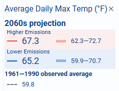
The cursor is a vertical line you can move on the graph. When you click on the cursor, a pop-up window appears displaying the data at that point (date). The type of data, in this case Average Daily Max Temp, is displayed at the top. The second line is the date the cursor is on when the measurements are taken, in this case, 2060
The red band (Higher Emissions) values for Average Daily Max Temp, in this case 67.3 degrees, with a range of 62.3-72.7 degrees.
The blue band (Lower Emissions) value is 65.2, with a range of 59.9-70.7 degrees.
The final line in that pop-up window provides the baseline value for Average Daily Max Temp of 59.8
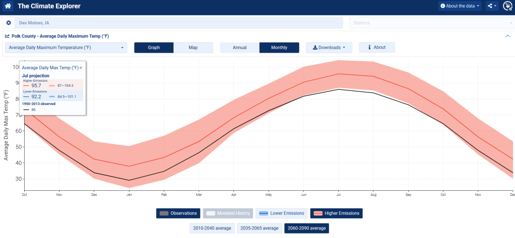
Monthly display
When you click on the Monthly button, the same data seen in the graph above, is displayed as months of the year (below).
Use the buttons below the graph to select various options. In this case, the Observations button is selected, so that is plotted as a black line on the chart.
The Higher Emissions button is selected in this case, displayed as the red line.
The data displayed is chosen from one of the three periods of dates, selected from the buttons below the graph. In this case, the data is from the years 2060 through 2090
The popup window displayed is from the month of July for the selected time period (in this case 2060 through 2090. That popup window displays the Average Daily Max Temp of 95.7 degrees with Higher Emissions, or 92.2 degrees under Lower Emissions scenarios. The reference value is 86 degrees from 1950 to 2013
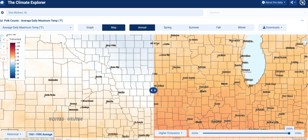
MAP
When the MAP button is selected, the following interactive map appears. Again, this is data for Des Moines (Polk County), Iowa.
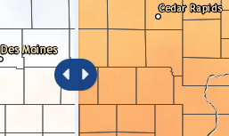
As you drag the blue, double arrowed cursor to the right, the portion of the map showing on the left displays the Average Daily Maximum Temp of the historical data (1961-1990). Moving the cursor to the left reveals more of the maximum temperature map for the years indicated at the bottom of the right side of the map. In this case, from the 2090s
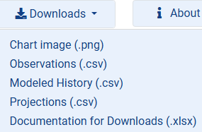
Downloads
The Downloads button at the top right will display the following menu choices for you:
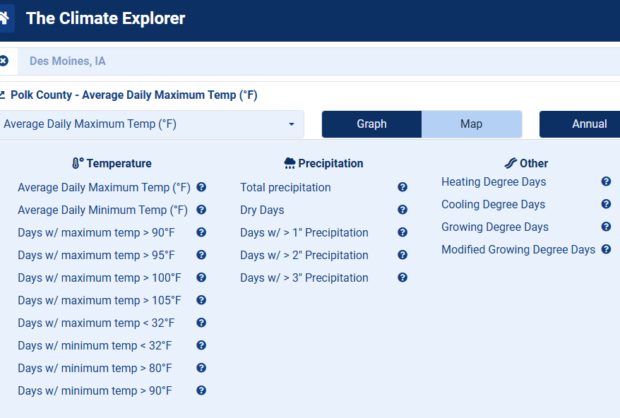
All of the graphs above were for the Average Daily Maximum Temperature for Des Moines, Iowa. The menu of choices for the data to display is listed above. Here are a couple of other sets of data to graph.
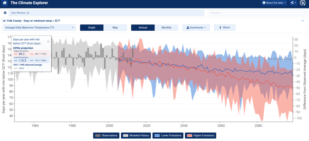
Days with minimum temp < 32 degrees
This graph is of the number of days with a minimum temp < 32 degrees (freezing). There were 136.2 days with freezing temps from the baseline of 1961 – 1990
The data from the cursor at the 2090s period shows the number of freezing days fell to 88.3 with Higher Emissions, 110.5 with Lower Emissions.
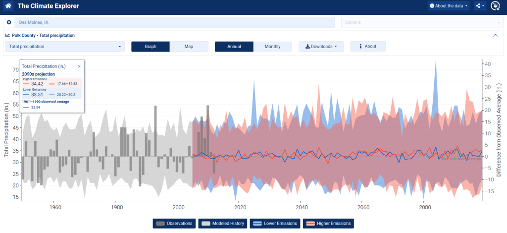
Total Precipitation
This is the graph of Total Precipitation for Des Moines. Under High Emissions the total rainfall would be 34.42 inches, compared to the baseline of 32.5 inches 1961 – 1990