This is a continuation of yesterday’s introduction to climate projections.
First, I’d like to mention a couple of things.
What is the difference between projection and prediction?
Climate scientists use the terms ‘predictions’ and ‘projections’ to describe two different kinds of information that are both important on decision timescales. ‘Predictions’ describe the forecasted climate for the next few months or years, which are strongly influenced by natural year-to-year or multi-year cycles of natural variability. We refer to the models used to make decadal predictions as ‘initialised’ because the most recent, observed climate conditions are important for forecasting the next few years. On the other hand, ‘Projections’ refers to the information for several decades ahead, which tell us how the climate might respond in the longer term to scenarios of greenhouse-gas emissions and associated socio-economic pathways.
Data
Accurate data is essential. This is an important subject that will need another blog post to discuss.
The Climate Explorer
Yesterday I wrote about National Oceanic and Atmospheric Administration’s (NOAA) Climate Explorer. https://crt-climate-explorer.nemac.org/
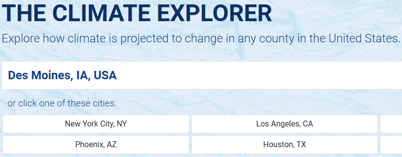
To use the tool, enter the location you are interested in the box. States must be entered as two letter abbreviations.
Climate Graphs
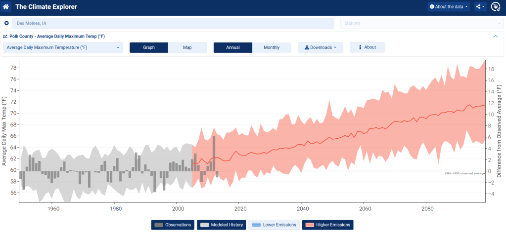
After entering the locality you are interested in, this dashboard appears. Select Climate Graphs in the middle of the top row (red arrow).

After you click on Climate Graphs on the dashboard the following graph is displayed.
This is the graph for average daily maximum temperatures (F) for Des Moines (Polk County). (Note: all temperatures are in Fahrenheit.)

This is a complex graph that I will discuss next. (At the end of this post is the explanation of this graph. You can display that Help information by clicking the About button on the top right of the graph.)
Baseline data
The vertical axis on the left side of the chart is the scale for the Average Daily Max Temp.
The vertical axis on the right side is the scale for the Difference from Observed Average. The baseline (0) is the observed average maximum temperatures from 1961 – 1990.
The average daily maximum temperature for those years in Des Moines is 59.8 degrees. (You might have noticed that baseline is slightly higher from the baseline over those years in Madison of 56.3 degrees.) The vertical scale on the right is difference between the temperatures on the graph and Des Moines’ baseline of 59.8 degrees.
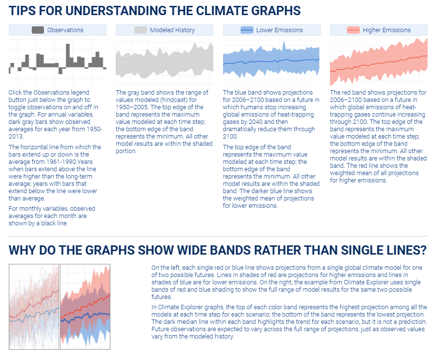
The gray part of the graph displays the data that baseline is calculated from. You can display of this data by clicking on the two buttons below the graph, OBSERVATIONS and MODELED HISTORY

Lower and Higher Emissions Scenarios
How rapidly the temperatures will continue to rise is driven by greenhouse gas emissions. The graphs from the climate explorer show two different scenarios. With Higher Emissions temperatures rise more rapidly. This graph displays the higher emissions projections (Red). You toggle displays of Lower Emission and Higher Emissions on and off using the buttons below the graph.
Higher Emissions
Lower Emissions
The Lower Emissions scenario shows projections for 2006-2100 based on a future in which humans stop increasing global emissions by 2040 and then dramatically reduce them through 2100.

The first graph in this post shows all of these sets of data combined together.